Wheels Up Booking Flow redesign
Wheels Up is one of the world’s leading private aviation companies operating in an increasingly competitive market where customer expectations continue to rise. As a premium membership-based service, the booking experience plays a critical role in both customer satisfaction and revenue conversion.
The booking journey had evolved organically over time, creating friction points that made it harder for members to quickly search, compare, and confidently book flights.
My goal was to help streamline the booking experience by identifying friction points, simplifying key moments in the journey, and creating a more premium digital experience that matched customer expectations.
The Business Challenge
Improve booking conversion by reducing friction throughout the search and booking process while supporting broader business goals around customer retention and revenue growth.
Key challenges included:
Low visibility of core booking tools
Outdated interface patterns
Limited pricing transparency
Increased competition offering more flexible booking experiences
Need to align the experience more closely with Delta Air Lines brand standards after acquisition
User Pain Points
Members needed a faster and more intuitive way to:
Search available flights
Compare pricing options
Evaluate travel flexibility
Make confident booking decisions
The existing experience required too much effort during moments where users expected speed and convenience.
My Role
I partnered closely with product managers to translate business requirements into user-centered design solutions.
Responsibilities included:
Auditing the existing booking flow
Identifying UX friction points
Redesigning key booking touchpoints
Creating scalable UI solutions
Collaborating with product and engineering teams on implementation
Opportunity 1: Making Search More Accessible
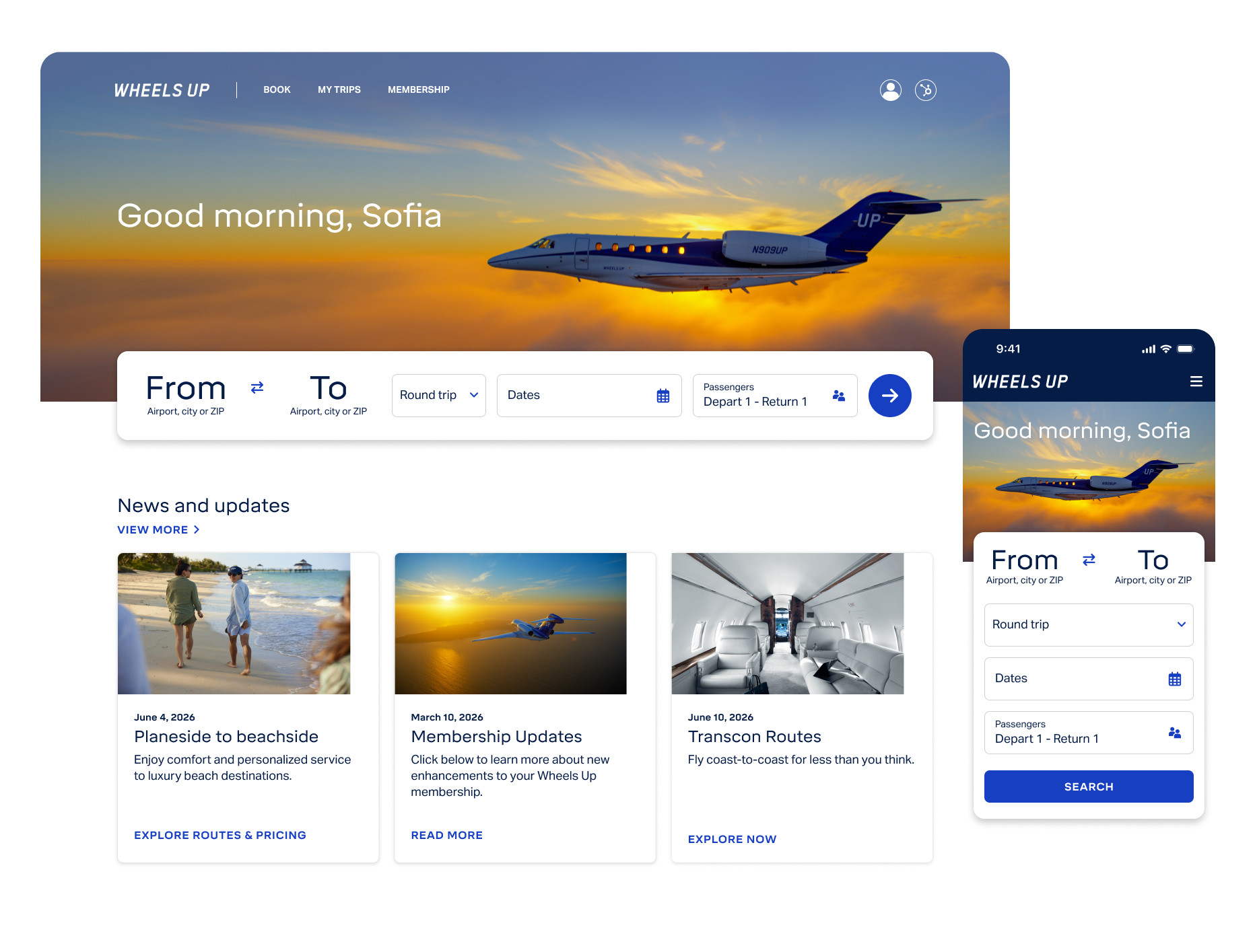
The original search experience was buried within the homepage experience and required users to take an extra step before beginning their booking journey.
This created unnecessary friction at one of the most critical conversion points.
Solution:
We repositioned search as a primary homepage feature by:
Moving the search widget front and center
Modernizing the UI
Reducing unnecessary friction to begin booking
Creating stronger visual alignment with Delta Air Lines brand standards
Opportunity 2: Increasing Pricing Transparency
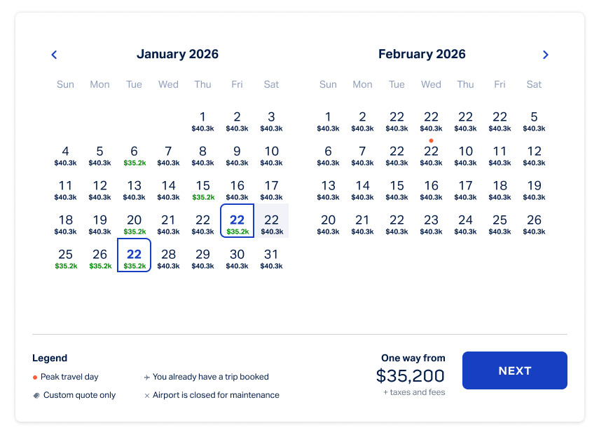
Members needed more visibility into pricing and availability while selecting travel dates.
Competitors were increasingly offering transparent pricing models that allowed travelers to make faster decisions.
Solution:
I redesigned the calendar experience to surface:
Pricing visibility
Availability indicators
Faster decision-making support
Greater operational transparency
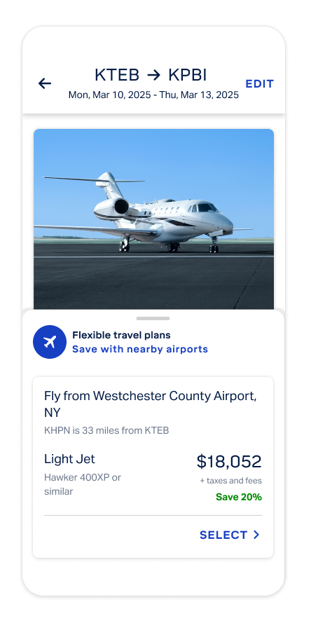
Opportunity 3: Supporting Flexible Travel Decisions
Once users reached flight results, the business wanted to encourage bookings by surfacing alternative travel options for members with flexible schedules.
The challenge was introducing additional options without overwhelming users.
Solution:
I designed a flexible travel feature card that:
Surfaced alternative route options
Highlighted cost-saving opportunities
Maintained focus on primary search results
Could be toggled on/off based on business needs
This created visibility without distracting from the primary booking flow.
Outcome
The redesign helped modernize one of the company’s most critical revenue-driving experiences by:
Reducing friction at key booking moments
Improving pricing transparency
Supporting more confident booking decisions
Creating a more premium customer experience
Most importantly, this work reinforced how thoughtful UX improvements can directly support both business growth and customer loyalty.